SHARE


Our life is filled with colors,
which represent phenomena and shapes
Our furniture, daily necessities, clothes, and many other items are already colorful. So, I thought that it would be sufficient to use only material colors, or achromatic colors at most, in architectural design. However, to be honest, I just did not have specific ideas for choosing colors .
Although I was interested in the concept that views a color as a phenomenon. I first learned the word “structural coloring,” a long time ago, in the book “The Nature and Science of Self-assembling” by Kuniaki Nagayama. There is a shining blue butterfly called the Morpho butterfly that insect collectors long for. In the book, it is said that this blue color is generated because the butterfly’s wing scales have a minute structure that matches the wavelength of blue light in the spectrum. I was fascinated by this fact. That is to say, color is a shape. In the famous Blue Cave, too, what we see is an optical phenomenon caused by the shallow depth of water over white sand and the shape of the deep cave that allows light to pass through only from one direction. I thought that the color generated as a phenomenon is different in nature from a painted color, such as the blue painted onto a wall because of its calming effect.
However, for this Monet exhibition, I chose ready-made colored products. Then, I was unexpectedly praised for the color I chose. So I feel my mind is changing a little.
Looking for the world of natural light
that invites us into a painting
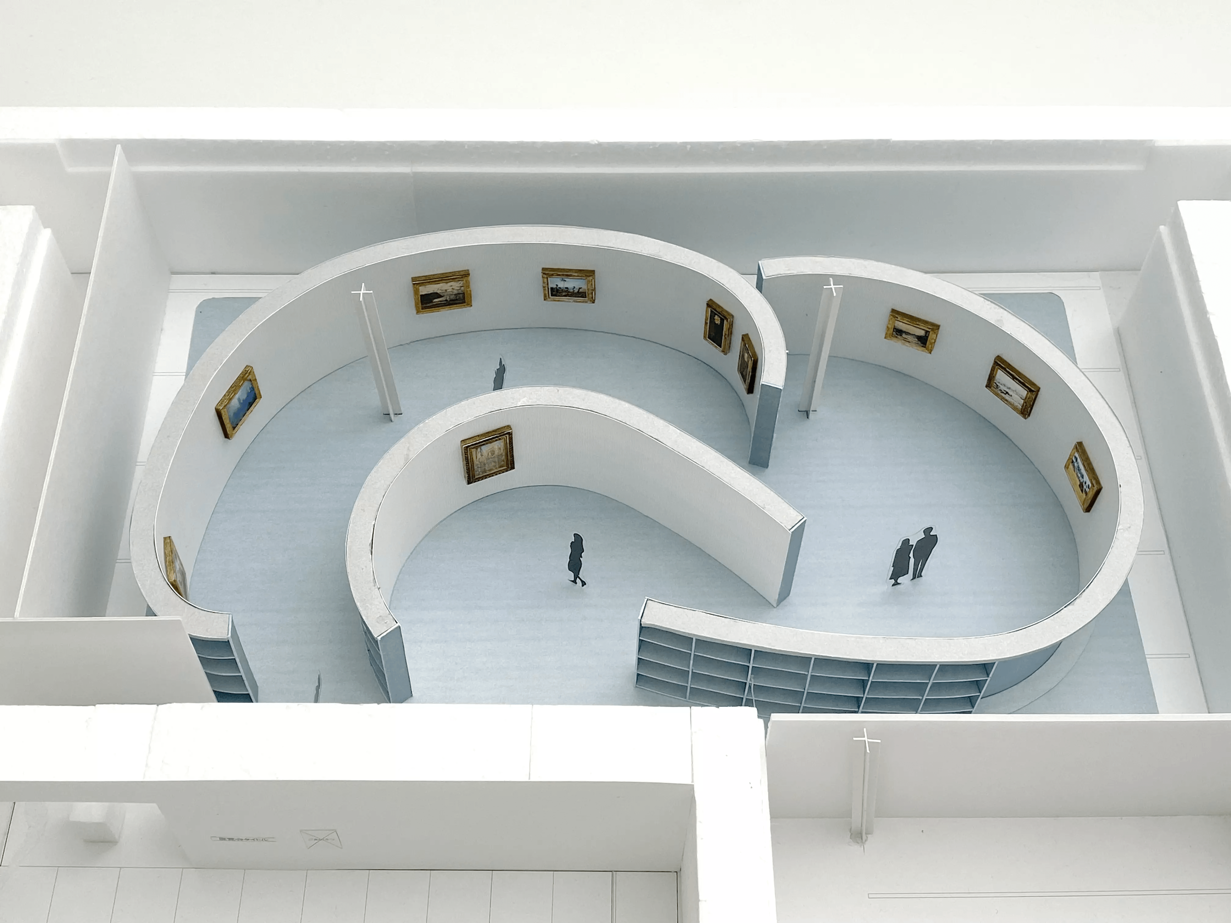
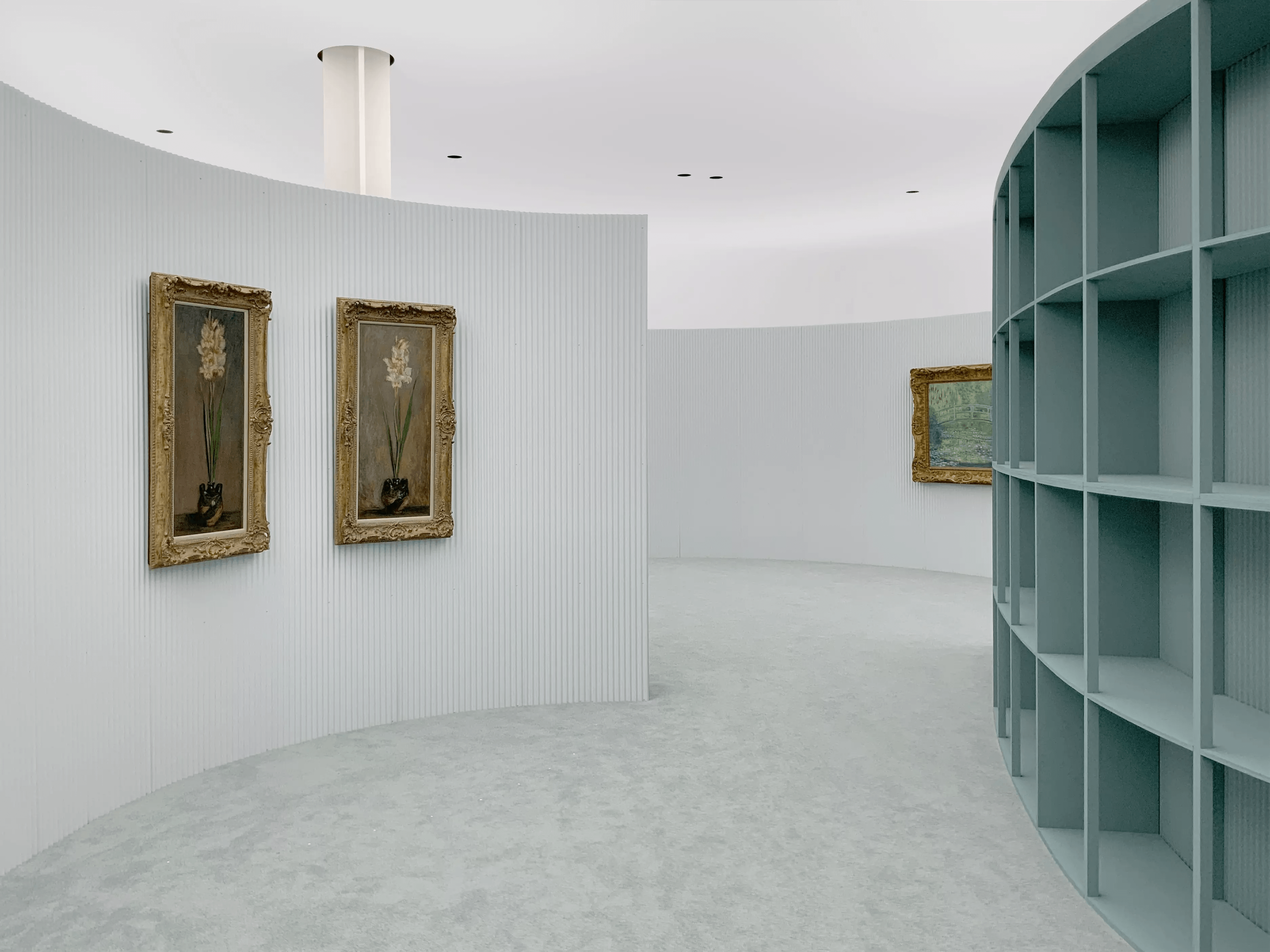
At the exhibition site of “Monet: In the Light,” to illuminate the paintings, we do not use the same number of spotlights as the number of pictures. Instead, we cover the ceiling with a white film and illuminate it with upward-facing lighting installed on the exhibition walls. This method fills the entire venue with a single large light.
Monet’s paintings were born in an era when the advent of tube paints made it possible to take a canvas outside and paint there. By filling the space with the light of a cloudy day, I wanted to have the visitors experience going on a journey that transcends time and space to where the painter placed his canvas under the sky.
This idea worked very well, but there was one big problem. The bright ceiling was reflected in the glass of the frames. The gently curving layout of the exhibition walls and the dark color on the back of the walls were actually designed to counteract this reflection.
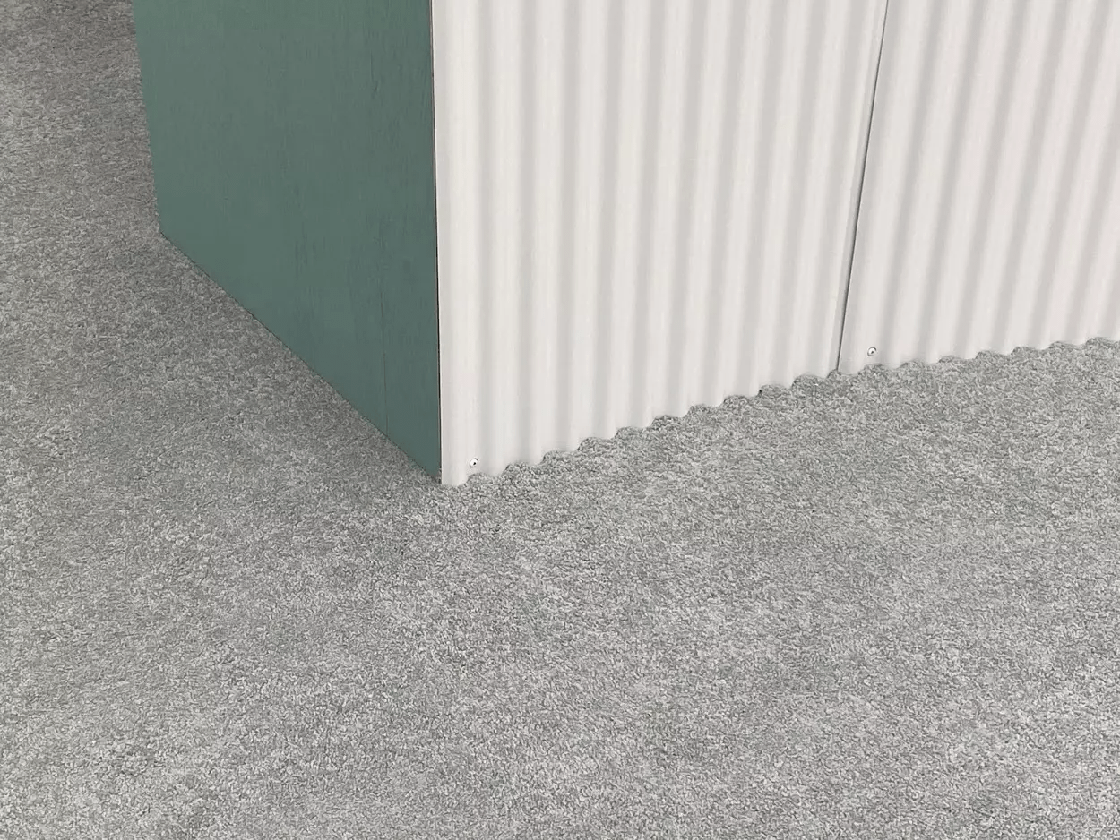
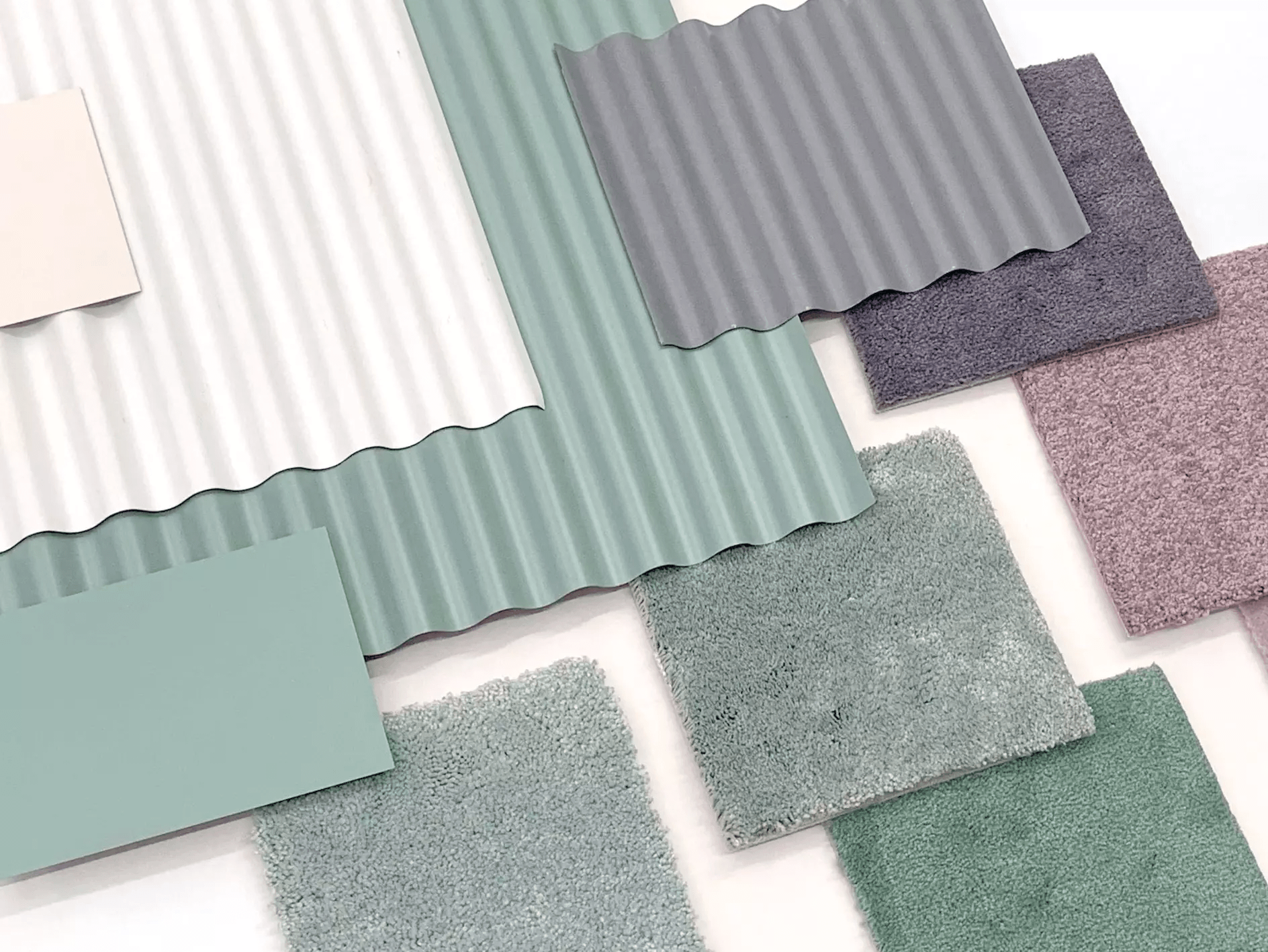
The wall is made of an inexpensive galvanized iron sheet that can be found anywhere. I felt that such simplicity would rather match the paintings by Monet, who chose ordinary landscapes as his theme. I first narrowed down the colors shown in the color swatch for the ready-made iron sheet to the ones with the required brightness. Then I chose deep green, which has probably been inspired by Japanese landscapes. I chose this green mainly because I wanted to provide the impression that the exhibition room, located in the basement, is seamlessly connected to the foyer, which is filled with the light that has passed through the skylight and has been spread by the pale green glass walls, where visitors can enjoy a leisurely time after walking through the forest of Hakone to the museum. However, I was surprised to see that people try to interpret the meaning of the color of the exhibition walls in their own unique ways.
Approaching from the “tail”
to the essence of color
To be honest, I have not yet found the answer to the question: ‘What is color?’ However, as many people have tried to find various meanings relating to color at the Monet exhibition site, I feel that I have become able to vaguely see the “tail” of color. Specifically, I feel that color has the capability to attract various meanings and link itself freely with them, rather than just having a fixed meaning in itself. If I choose a color based on a meaning, my thoughts will stop expanding further. So, what I want to try next is to tentatively place a color, and then try to capture any meaning that emerges from there.
Providing a creative architectural design for all individuals
free from social circumstances
It's been a long time since I entered the architectural field. While I am grateful that my work has often been highly evaluated, I feel more strongly each day that I’m not matured enough as an architect without my own specific style. I hope that something that may make a big difference will await me and my office members after we capture the “tail” of color.
There is one thing that hasn’t changed since I was in prep school. That is, I believe that I’m always wanting to be a free and creative individual, no matter what the society or social system. I think that this belief will never change.